ZEBU:


The Zebu website works really simply and helps to guide the viewer smoothly through the sight. The displaying of work in one square format helps to keep a consistency amongst the images displayed on the sight. The format they have decided to use also means that the main header of the site always remains in the same place and just the lower portion of the webpage changes. This makes the experience on the website feel very easy and clear.
NATURAL BORN KRILLER:


Julia Laskowski is the illustrator behind, 'Natural Born Kriller'. Her website is similar to that of Zebu's with a bold, eye catching header at the top of the page that remains in the same place throughout ones movement across the website. I think this is a really important component of having a website as it helps to give a personality to the site, making it original. She also uses a similar size for each of the images displayed on the site which makes viewing her work very simple. Using a bold, simple typeface for the main headers gives the viewer a clear idea as to how they can navigate the page.
CALLUMJSP:


Compared to the other websites, Callumjsp doesn't feature much transition in his website when moving through the tabs. The work he displays is all positioned in the same lay-out which is accessed through a menu sitting under his logo in the top left-hand corner. I think this works nicely. It would be good though to perhaps include an 'About Me' section or something similar which would give a more rounded image of him as a practitioner.
BENDIK KALTENBORN:
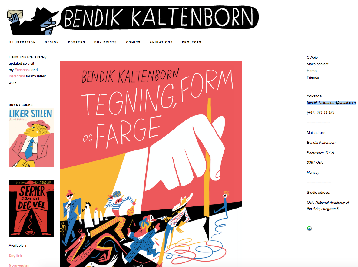


I'm a big fan of Kaltenborn and his work, especially his collaborative work with Todd Terje. His website has a wealth of information on it that would be useful to anyone wanting to commission him or buy any of his work. However, I think it is a bit overwhelming compared with the other sites I have reviewed above. Having a more simple and direct approach to displaying one's portfolio online seems to make the website more engaging and approachable to the consumer/client.


No comments:
Post a Comment